
How to Format a Book for Self-Publishing (2026 Guide)
You finished the manuscript. You typed the last word of the last chapter, sat back, and felt that rush every writer chases for months, sometimes years. Then you opened it in Google Docs to get it "publish ready" and realized nobody warns you about this part.
Formatting a book is not the same skill as writing one. A lot of authors assume it's just picking a nice font and hitting export, then they get their proof copy from KDP and the margins are wrong, the chapter titles are inconsistent, and the first page of chapter one has a random blank line nobody remembers adding. This guide walks through how to format a book for self-publishing: what book formatting actually involves, the mistakes that trip up almost every first-time author, and where book formatting software built for this (like WriteO's Book Designer) saves you from redoing the same work three times.
What Book Formatting Actually Means
When people say "format my book," they're usually talking about two different things at once, and mixing them up is where most of the confusion starts.
Interior formatting is how the inside of your book looks and behaves: fonts, chapter headings, drop caps, scene breaks, page numbers, margins, trim size. This is what makes a manuscript read like a novel instead of a Word document with a title page slapped on.
Front and back matter is everything that isn't your story: title page, copyright page, dedication, table of contents, acknowledgments, author bio, "also by this author" pages. Readers skim past these in seconds, but their absence (or sloppiness) is one of the fastest ways to make a book look self-published in the worst sense of the term.
You need both done well, and you need them done consistently across every chapter, which is exactly where manual formatting in Word or Docs falls apart.
Book Trim Size: The Decision Everyone Skips
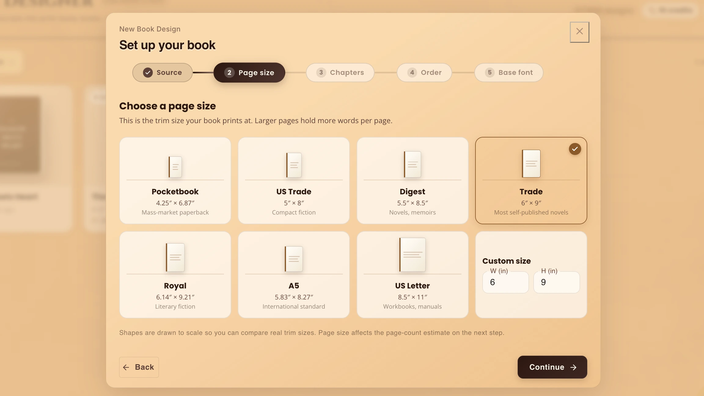
Before you touch fonts or spacing, you need to know what physical size your book will be, because everything else (margins, font size, page count) is built around it.
Most fiction lands somewhere between 5x8 and 6x9 inches. Genre matters here. Fantasy and sci-fi doorstoppers often run 6x9 for the extra room. Romance and contemporary fiction frequently sit at 5x8 or 5.5x8.5, since those trim sizes feel more intimate in the hand and keep page counts from looking intimidating. If you're planning both print and ebook, this decision mostly affects the print file, but it's still worth locking in early so your test reads (yes, print out a chapter and hold it) actually reflect what a reader will get.
WriteO's Book Designer has trim size built into the setup step, with the common industry sizes already available, so you're picking from real options publishers and printers actually support instead of guessing and hoping KDP doesn't reject your file.
💡 Tip: Pick your trim size before your cover. A 90,000-word novel runs roughly 360 pages at 5x8 and closer to 280 at 6x9. That changes your print cost and your spine width, so your cover can't be finished until the size is locked in. |
Book Typography: Less Personality, More Discipline
New authors tend to want their book to "look unique," and typography is where that instinct usually backfires. Readers are not supposed to notice your font. They're supposed to notice your story. The safest move is a clean, readable serif for body text (something like Garamond, Bembo, or a similar classic) and reserve any personality for chapter headers or the cover.
A few rules that hold up across genres:
Body text between 10.5 and 12 point, depending on your chosen font's actual size (some fonts run small or large at the same point size)
Line spacing (leading) slightly more than single, usually 120 to 145 percent of your font size
Justified text for print, since ragged right edges look unfinished in a printed book, though left-aligned is standard and expected for ebooks
Consistent paragraph indents instead of blank lines between paragraphs, which is a manuscript convention, not a published-book one
This is exactly the kind of decision that's painful to change late, because if you've manually formatted 300 pages and then decide your font choice was wrong, you're redoing every page by hand. Working inside WriteO means your typography choices apply globally from a theme, so switching fonts or line spacing updates your whole manuscript in one move instead of triggering a full re-format.
💡 Tip: Print one page before you commit to a font. Type looks different on paper than on a bright screen. Print a single page at your real trim size and read it at arm's length. If it feels cramped or thin, switch now, not after three hundred pages. |
Drop Caps and Chapter Openers
That oversized first letter at the start of a chapter isn't just decoration, it's a signal to the reader that a new section has begun, and it's been a convention in published fiction for centuries. It sounds like a small detail, but it's one of the fastest visual tells between "formatted like a real book" and "formatted like a manuscript." The same goes for chapter opener treatment generally: a bit of extra white space before the first line, maybe a small ornament or the chapter number styled distinctly from the body text.
The catch is that drop caps are genuinely fiddly to do by hand. Word technically supports them, but getting the sizing, font pairing, and spacing to look right (and to stay right after you edit the paragraph later) is a common source of formatting headaches. This is one of the areas where WriteO's Book Designer earns its keep, since drop caps are a toggle-on style applied through your book settings rather than something you're eyeballing chapter by chapter.
💡 Tip: Three lines deep is the safe default. A drop cap spanning three lines works at almost every trim size. Set the rest of the first word in small caps to smooth the jump back to body text, and skip the drop cap when a chapter opens with dialogue, since the quotation mark floats awkwardly. |
Scene Breaks: Small Detail, Big Impact on Readability
Scene breaks are the little visual pause between sections within a chapter, whether that's a change in POV, a time jump, or just a beat shift. Skip them and readers get disoriented mid-chapter, wondering why the scene suddenly changed with no warning.
The classic options are a centered asterisk, three centered dots, a small ornament, or just extra white space. What matters more than which one you pick is consistency. If you use three asterisks in chapter two and switch to a fleuron in chapter nine, it reads as careless even if most readers can't articulate why.
WriteO lets you set a custom scene break style once, choosing from simple marks or decorative ornaments, and have it apply everywhere you insert one, so you're never manually retyping asterisks and praying the spacing above and below matches what you did four chapters ago.
💡 Tip: Never rely on blank space for ebook scene breaks. If the gap lands on a page turn on someone's Kindle, it simply vanishes, and your POV shift goes with it. Use a visible marker like asterisks or a small ornament instead. |
Front and Back Matter: Do the Boring Pages Right
Front matter is unglamorous, but it's the first thing a reader (or a retailer's "Look Inside" preview) actually sees, so getting it wrong is a worse first impression than a slightly off font choice in chapter twelve.
At minimum, your front matter should include:
A half-title page (just the book title, nothing else)
A full title page (title, subtitle if you have one, author name)
A copyright page (year, your name or publishing entity, ISBN if you have one, a short "all rights reserved" statement, and for fiction, a line noting it's a work of fiction)
A dedication, if you want one
A table of contents (expected for ebooks, optional but common for print)
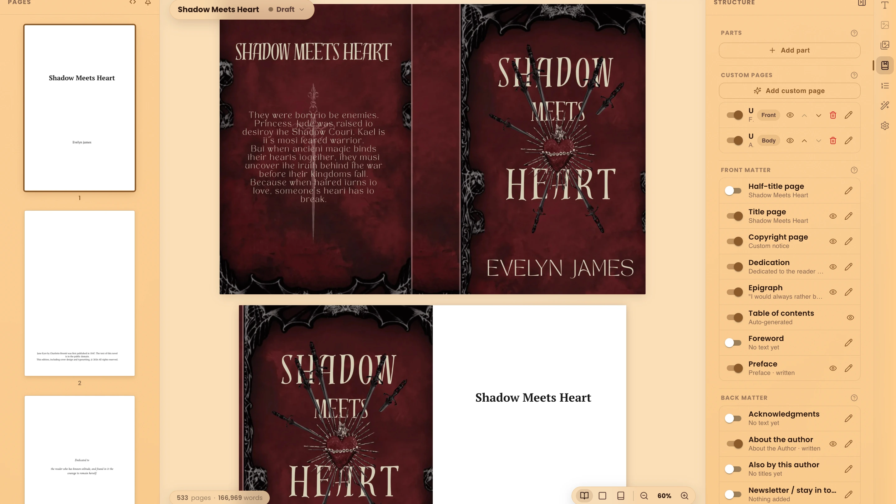
Back matter is shorter but still matters: an author's note or acknowledgments if you want them, a short author bio, and if this is book one of a series, a preview or "also by" page pointing to what's next. This is genuinely one of the more tedious parts to build manually because it means duplicating and adjusting a template across every new project. WriteO includes front and back matter templates inside Book Designer, so you're filling in fields rather than reconstructing a copyright page from scratch every time you start a new novel.
💡 Tip: Treat back matter as marketing. The reader who reaches it just finished your book and liked it. Give them your next title with a buy link, a newsletter signup, and for a series, the first chapter of book two. |
Print vs Ebook Formatting: They Are Not the Same File
This trips up almost everyone the first time. A print file and an ebook file need different things, and trying to force one file to do both jobs usually means one of them looks wrong.
Print books need justified text, a real trim size, mirrored margins (inside margin slightly wider than outside, to account for the binding), a running header or footer, and page numbers. Ebooks, on the other hand, are reflowable. There's no fixed page size because the reader's device controls that, which means fixed elements like page numbers and running headers don't belong in an ebook file. Instead, ebooks need clean internal navigation (a working table of contents that jumps to each chapter) and formatting that adapts cleanly whether someone's reading on a phone, a Kindle, or a tablet.
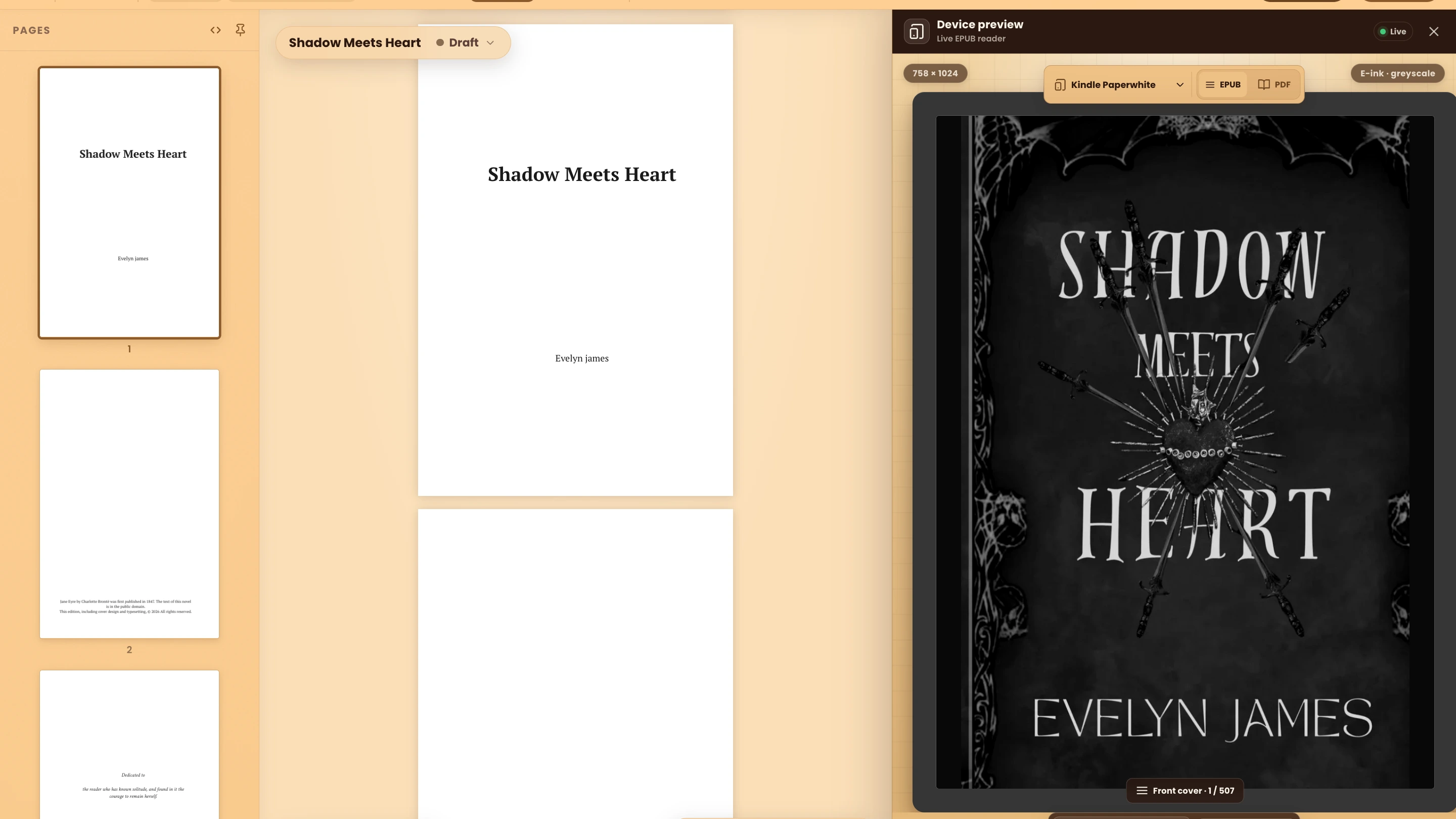
Trying to export a single Word document for both is how authors end up with page numbers floating in the middle of an ebook page or a table of contents that doesn't link anywhere. WriteO's export handles this split for you, generating a print-ready PDF and a properly structured EPUB from the same manuscript, so you're not maintaining two separate files or manually stripping print-only elements out of your ebook version.
💡 Tip: Preview your EPUB before you upload. Check three things: every table of contents link actually jumps somewhere, your scene breaks survive, and each chapter's first paragraph looks right. Amazon's free Kindle Previewer lets you check several screen sizes. Ten minutes here beats a one-star review about formatting. |
Book Formatting Mistakes That Show Up Most Often
A few formatting issues come up again and again in indie books, and they're worth checking for specifically before you call your manuscript done:
Double spaces after periods. A holdover from typewriter days that still shows up constantly. Worth a find-and-replace pass regardless of what tool you're using.
Inconsistent chapter heading styles. Chapter One in one font size, Chapter Two in another, because it was typed manually instead of applied as a style.
Widows and orphans. A single word sitting alone on its own line at the top or bottom of a page. Minor, but it's the kind of thing a trained eye catches instantly in a printed proof.
Tabs instead of first-line indents. Using the tab key to indent paragraphs instead of a proper paragraph style creates inconsistent spacing that becomes obvious once the file is converted to PDF or EPUB.
Forgetting a proper page break before each new chapter, which results in chapter two starting halfway down the same page chapter one ended on.
Most of these come from formatting manually in a word processor that wasn't built for book layout in the first place. They're not hard to avoid, they're just easy to miss when you're doing dozens of small manual adjustments across a 90,000 word manuscript.
Bringing It Together
Formatting isn't the fun part of finishing a book, but it's the difference between a manuscript and something a reader actually wants to hold or download. The good news is that once you understand what the process actually involves (trim size, typography, drop caps, scene breaks, front and back matter, and the print/ebook split) it stops feeling mysterious and starts feeling like a checklist.
If you're writing your draft somewhere that doesn't also handle formatting, you're looking at exporting to Word, then to a formatting tool, then troubleshooting why the fonts didn't carry over correctly. Writing and formatting in the same place, the way WriteO's Book Designer is built, means your manuscript moves straight from "done drafting" to "ready to format" without a conversion step in between, and any theme or style choice you make applies consistently across the whole book instead of chapter by chapter by hand.
If you haven't reached the formatting stage yet, start with how to outline a novel or how to build a story bible, and come back once the last chapter is done.
Your story already did the hard part. Formatting just has to get out of its way.
Frequently Asked Questions
QWhat trim size should I use for a novel?
QDo I need separate files for print and ebook?
QIs there free book formatting software?
QWhat's the best Vellum alternative for Windows?
QWhat font should I use for a book interior?
A classic serif like Garamond or Bembo, set at 10.5 to 12 point with line spacing around 120 to 145 percent. Save the decorative fonts for chapter headings and the cover.